🔍 Context and Challenge
🌄 Background
CVS is an American retail store, offering its shopping and healthcare services to people across the United States. Though it maintains its reliable presence in its physical stores, the CVS website still has to improve on a few elements in order to increase user satisfaction and reduce confusion.
🚩 The Problem
When users navigate the CVS site and come across a product card, they are able to view basic information about a product and add it to their cart. When clicking the Add button, however, they are met with an animation that may increase frustration:
After clicking the Add button there is feedback to show that the product is added, but after 3 seconds, the Add button reverts to its original state.
Though the overall flow was fleshed out, the lack of feedback regarding how many products were added to the cart proved to cause frustration and confusion. When I was testing the site, I unknowingly added my test product to my cart 40 times. Since there was no numerical feedback to show how many products were added to the cart, this caused frustration and needed to be addressed and changed.
Goals and Objectives
The success of this project was defined by iterative improvements to the CVS interface, implementing smooth animations and visual interest so that the user could navigate the site with full freedom.
The main goals I had for this project were to improve the Add button, but I expanded this to cover and implement the:
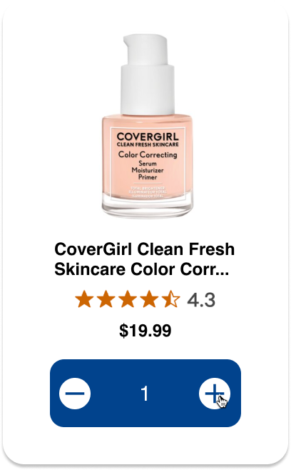
- Overall Product Card
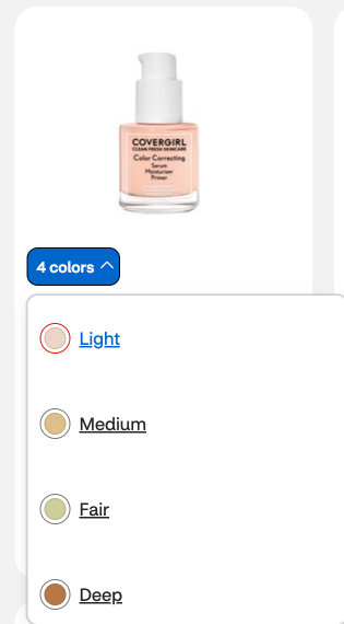
- Color Picker
- Add Button Container
- Add Counter
- Minus Counter
Timeline
Throughout this 10 week course, I worked to improve the CVS product page by implementing my own HTML, CSS, and JavaScript through feedback from my professor and peers.
The project was divided into Alpha, Beta, and Final phases, where we could research, design, and develop interactions iteratively into a cohesive final project.
In order to delve deep into microinteractions and embody their importance in my project, I highlighted the Triggers, Rules, Feedback, and Loops & Modes for each point in my redesign.
Process and Insight
Alpha
In this phase, I focused on the main component of my redesign, the Add button. The main deliverable for this stage was a recreation of the current CVS site component. In this, I mapped out the Triggers, Rules, Feedback, Loops, and Modes of the current site, and sought to develop those into a functional prototype. I implemented the hover states and feedback with CSS and JavaScript.
Beta
The Beta is where things were taken to the next level. In this stage, we were able to implement changes that we felt would take the interface to the next level. Since one of my pain points for the original CVS interface was the lack of feedback to show how many products were added to the cart, I wanted to tackle this by improving the counter.
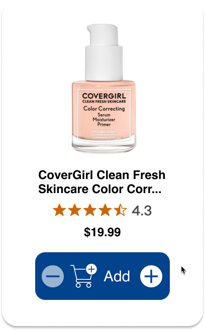
1. Add Button Before Hover

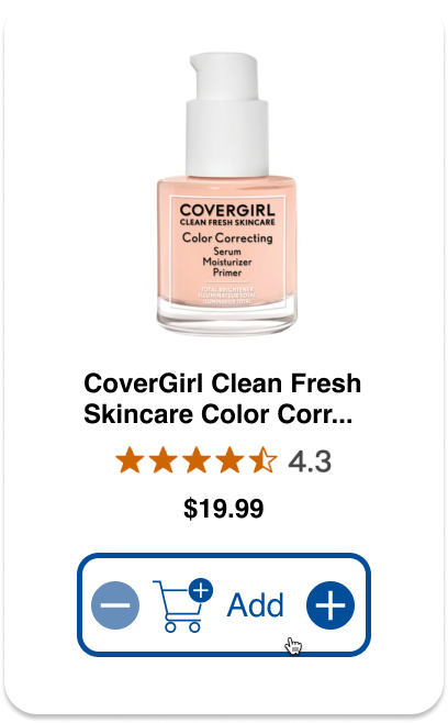
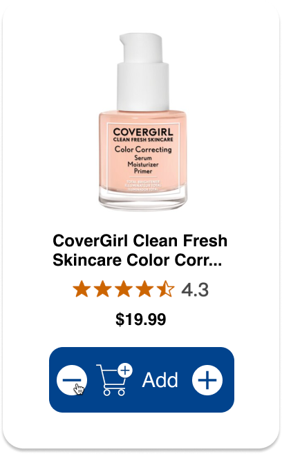
2. Add Button On Hover

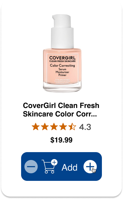
3. Add Button Hover On Plus

4. Add Button Click On Plus

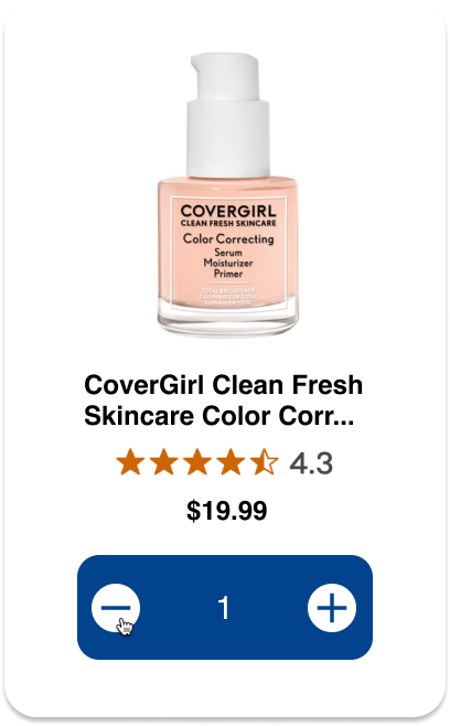
5. Add Button Hover On Minus

6. Add Button Click On Minus

Final
When prepping for my Final Build, I thought about what other elements I would like to see on the product card. When searching up skincare products, I found that certain products had variations with their colors and attributes. Because of this, I decided to adjust the color picker shown on the initial card. Instead of a confusing interface, I chose to simplify the color choices and incorporate into the simple and smooth design of my redesigned card.

The Solution
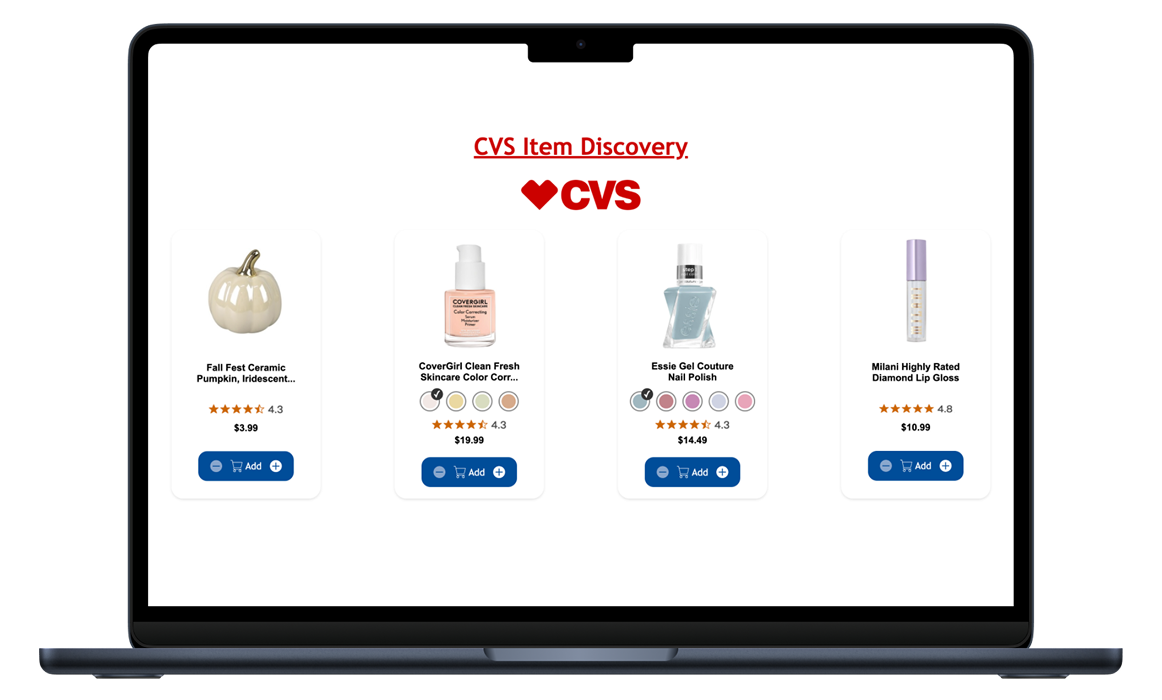
The culmination of this project came after combining the elements of the final into a grid of 4 cards that would showcase their individual products. I chose to add another product with color variations, and coded the project so they would work independently of each other. I incorporated smooth animations in between the image switches, checkmark, and number counter. The final build turned into the one stop shop for users to find crucial information about the product, choose their specifications, and add it to cart.
The Results and Reflection
I felt like this project was very valuable to me, because I was able to see my growth step by step throughout it.
This project is something I'd continue if I had extra time. Ideally, I would continue making microinteractions, in order to make my project look and feel more like the CVS interface, where you can continue checking out with the product you select.
I'd like to make a component where when the plus button is clicked on a card, a cart icon animates and increases the count of items in it. I feel like any additions I would make would ultimately round out the project.
I'm excited to see where this goes, and see how I can do better next time!
