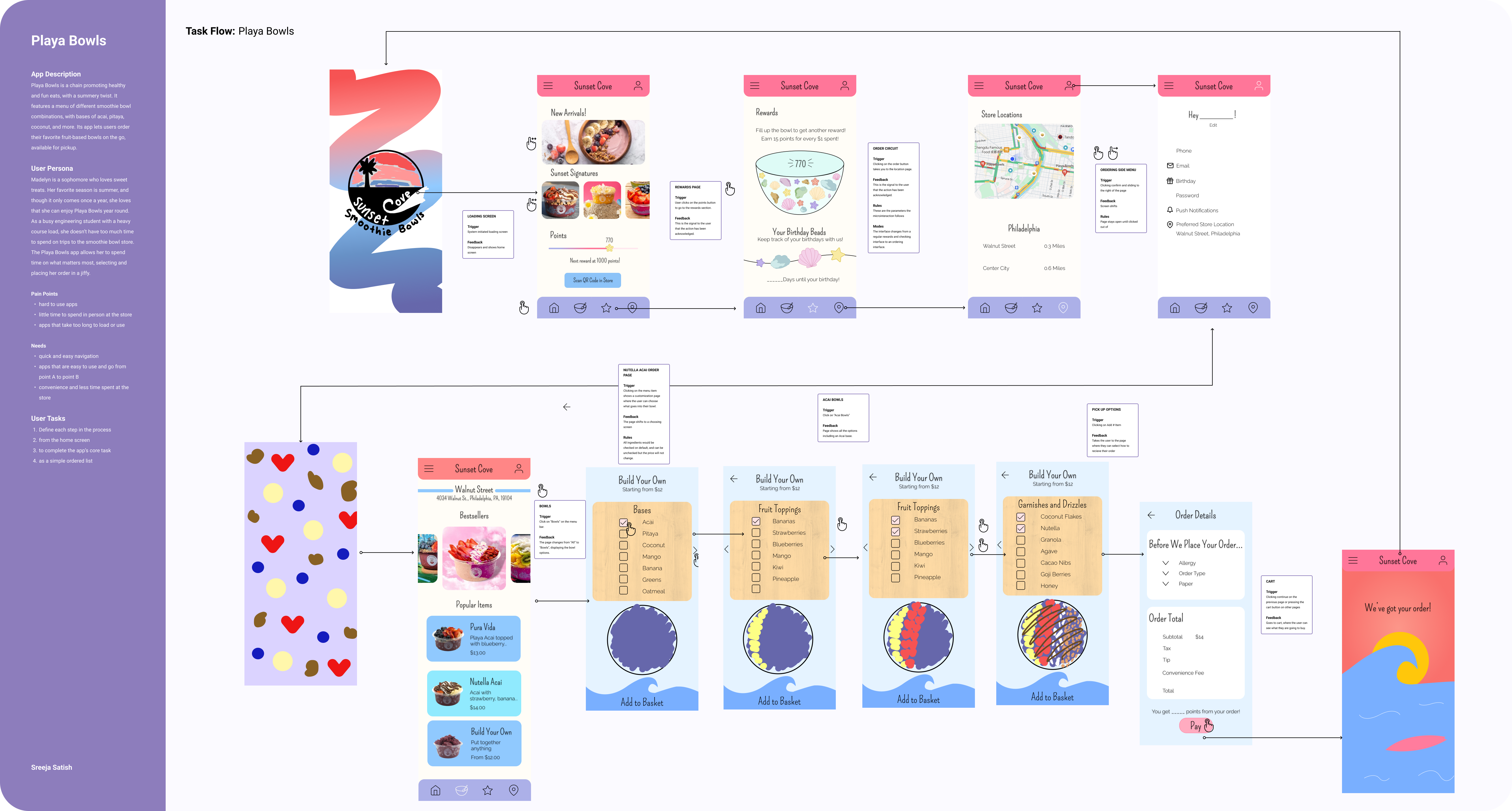
Through the course of my spring term of sophomore year I reedesigned the Playa Bowls app, aiming to increase user satisfaction and gamify the experience of ordering your favorite smoothie bowls. This yielded the app Sunset Cove Smoothie Bowls, which went through the process of going through app flows and thinking of engaging microinteractions to further improve the user's overall experience. I enjoyed creating a full app design with custom iconography and branding, and creating an animation to put the whole experience together.
UX Designer, UI Designer, Animator
10 Week Project
April 2024 - June 2024
Figma, Jitter
High Fidelity Mobile UI and Animated Prototype
In my 10 week Interaction Design Class, I learned to utilize microinteractions and their importance in elevating the user's experience to rebrand a mobile app.
I chose to redesign Playa Bowls due to its fun and playful physical brand identity that failed to translate into its mobile app.
A lot of food apps are more efficiency than pleasure, and since Playa Bowls is not something someone would get every day, I wanted to make the app more of a unique experience and address user pain points.
Here's why I thought Playa Bowls would be a cool app to redesign from the ground up:
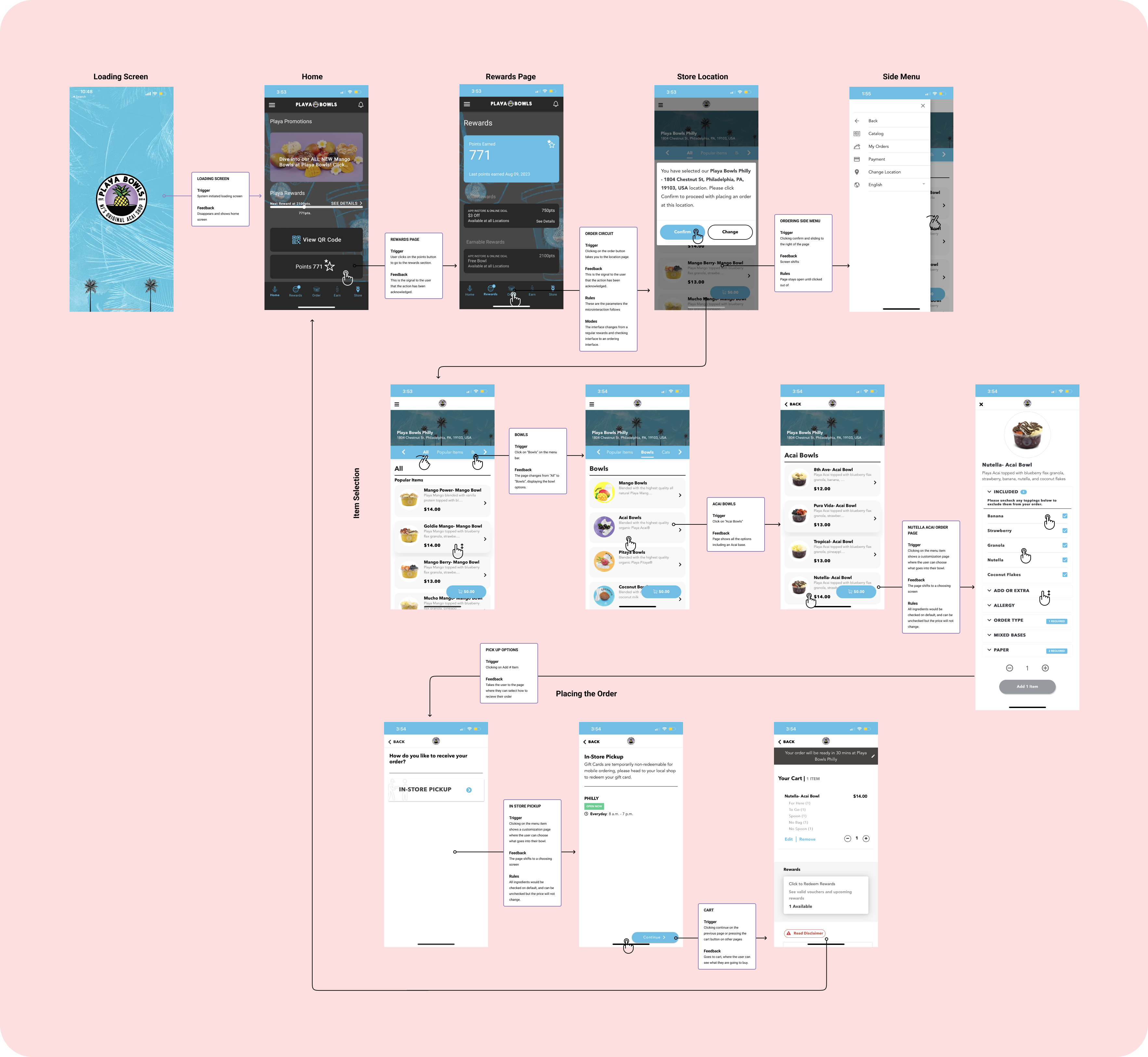
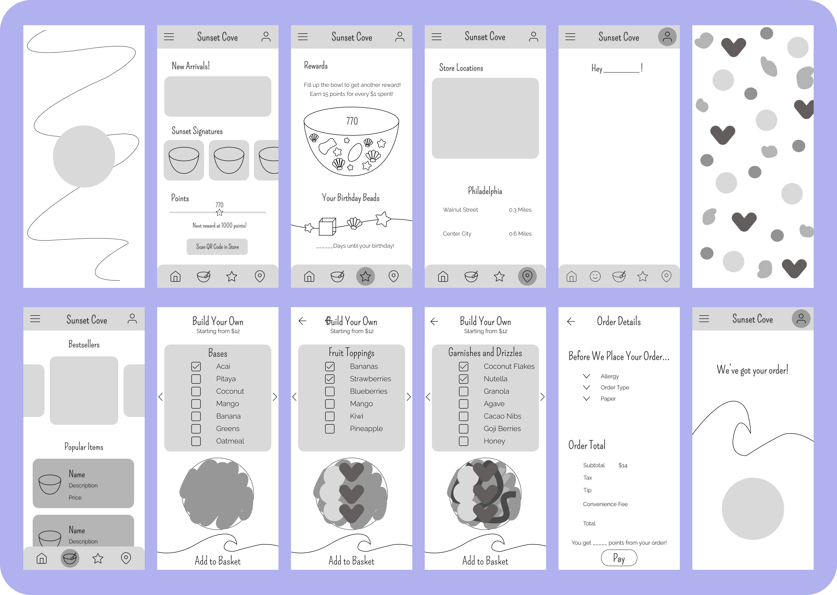
First, I went through the app, taking note of the path users took to get to their end goal of ordering an acai bowl. This is depicted through the current app UI, which highlights microinteractions through 4 main components of microinteractions:
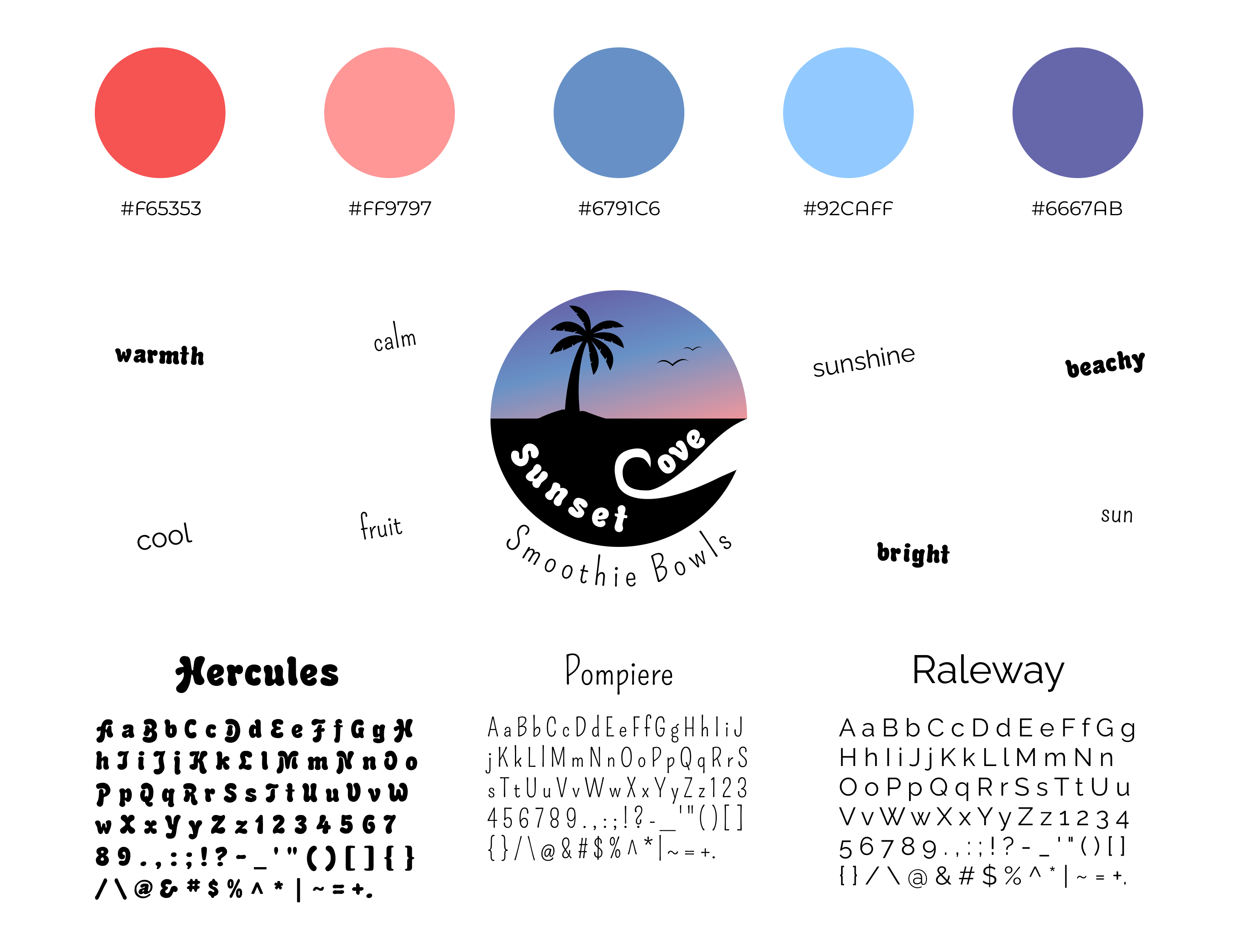
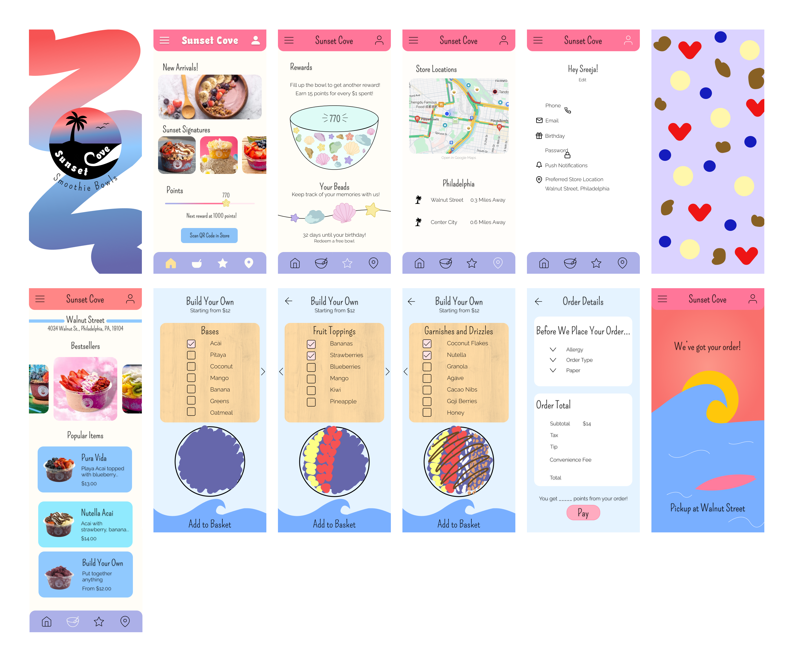
Rebranding the Playa Bowls app would take more than just improving the interactions on the app. In order to completely change the feel and form of the app, I had to think of colors, typography, and even descriptive words that would encompass the feeling of Sunset Cove.
Rebranding the Playa Bowls app would take more than just improving the interactions on the app. In order to completely change the feel and form of the app, I had to think of colors, typography, and even descriptive words that would encompass the feeling of Sunset Cove.
I wanted this app to embody a warm and bright feeling, alluding to the beach and summer which everyone thinks of when reminiscing about smoothie bowls.
I chose a varying color pallete with 5 shades, going from warm to cool. The 3 fonts, Hercules, Pompiere, and Raleway all provide a different vibe, but elevated the app screens and logo in order to emulate the summery feel. And the logo overall really painted a picture of Sunset Cove, displaying a calming picture of a palm tree overlooking a sunset.
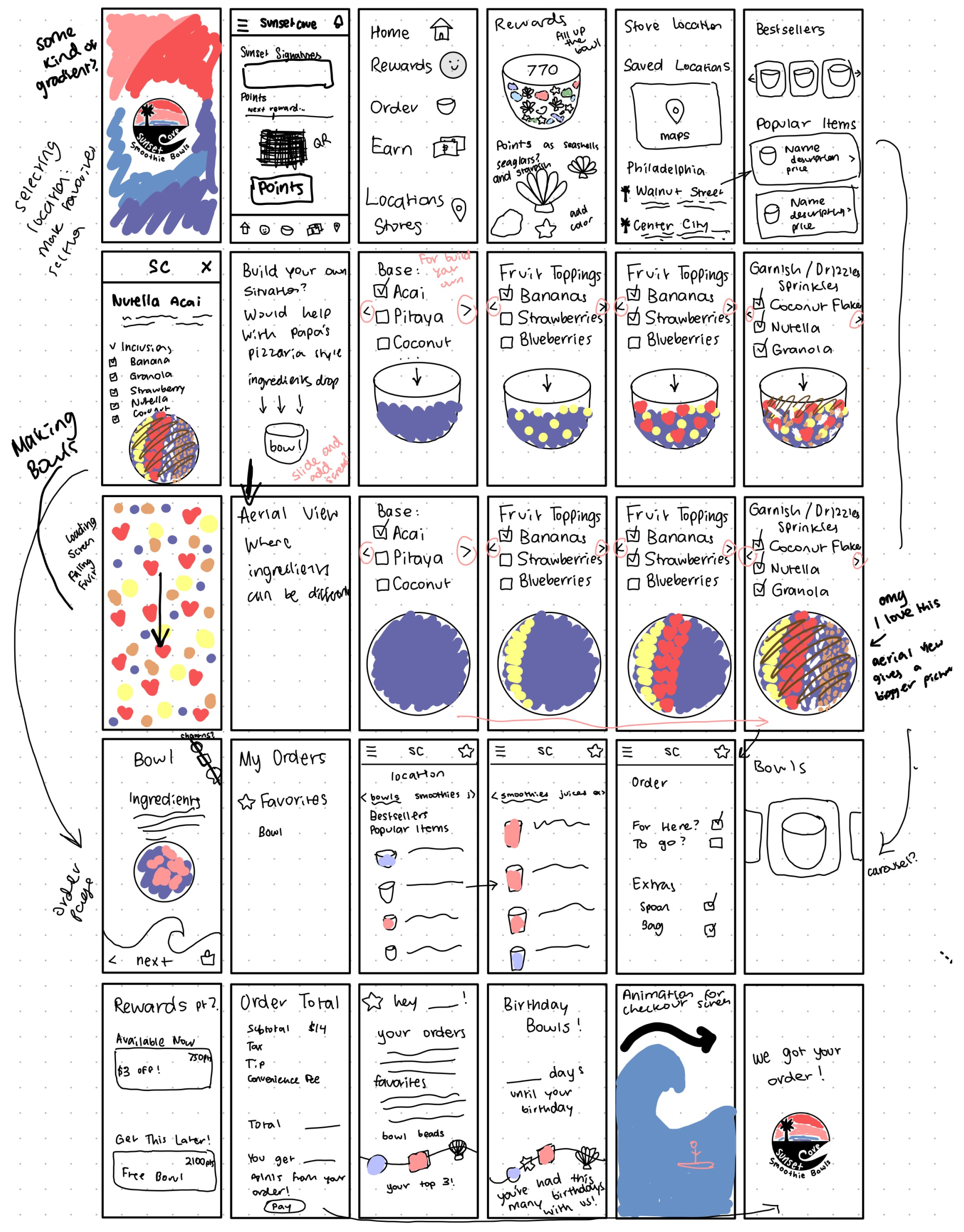
With a complete picture of what the app styles would encompass, it was time to brainstorm screens. I created 30 sketches displaying general screens, components, and the ordering system for the app.
This would be fundamental to the design, as it opened the door to personalized features that would elevate the UI and the user’s experience.
The wireframed app flow condensed the journey of the app. With this, a clearer picture was created, detailing how the user would navigate the app. The critical path was ordering a smoothie bowl, but the wireframe also created space for important screens and animations that would complete the experience.
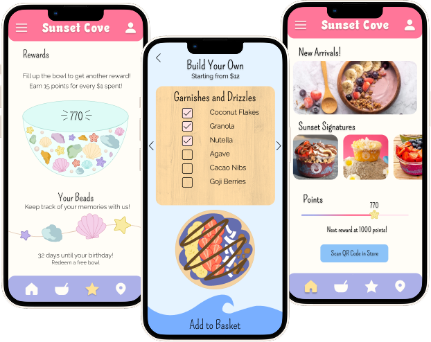
This is where the app came together and adopted its personality. Colors were added, and the cohesiveness of elements was explored. At this stage, I emphasized the various items on the app and spent time customizing the rewards screen, since it would be custom to the app. Though things were not set in stone, I was able to figure out how the puzzle pieces would fit and create a cohesive experience.
In this phase, I explored how to flesh out the Interaction flow of the app. I utilized the principles of microinteractions to set up a framework for my animation. In this, I specified how certain screens would be interacted with, and how information would be conveyed to the user.
Though I had a vision for how the app would feel when interacted with, it was a different story when put into an animation style. I had never worked with animations in the past, and had to create 5 unique animations for each phase of my microinteractions. However, this challenged my creativity, and I was able to differentiate the mid-fidelity and high-fidelity prototype because of the unique microinteractions I created at this stage.
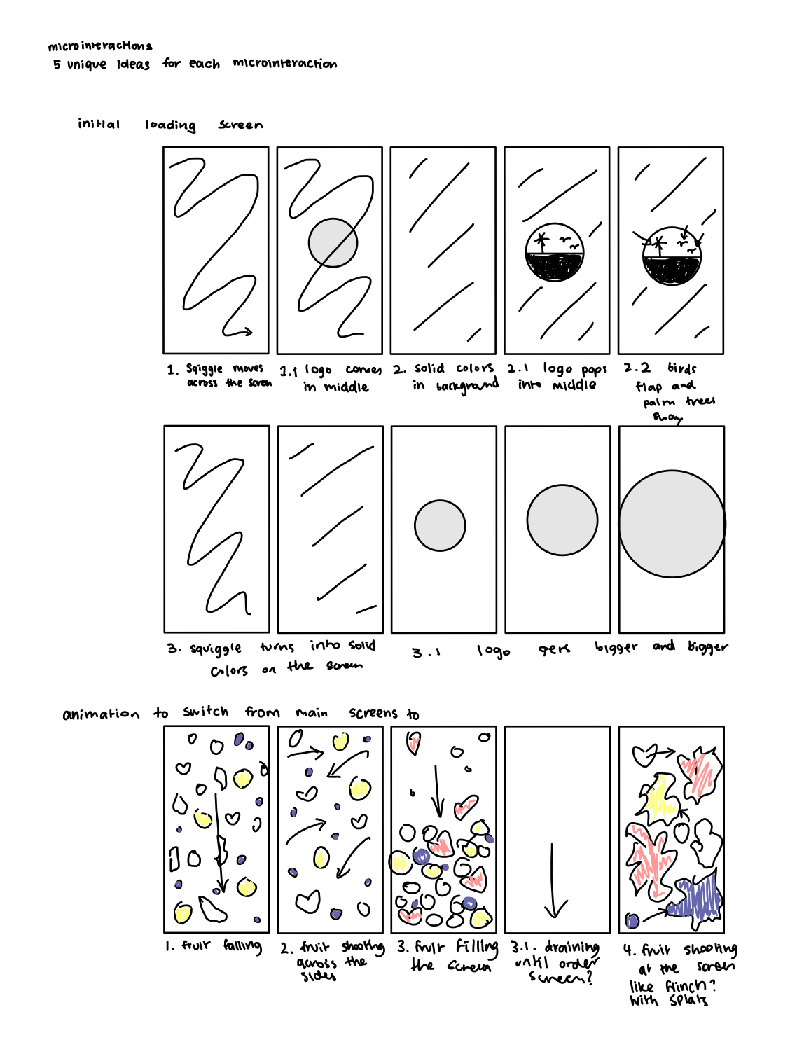
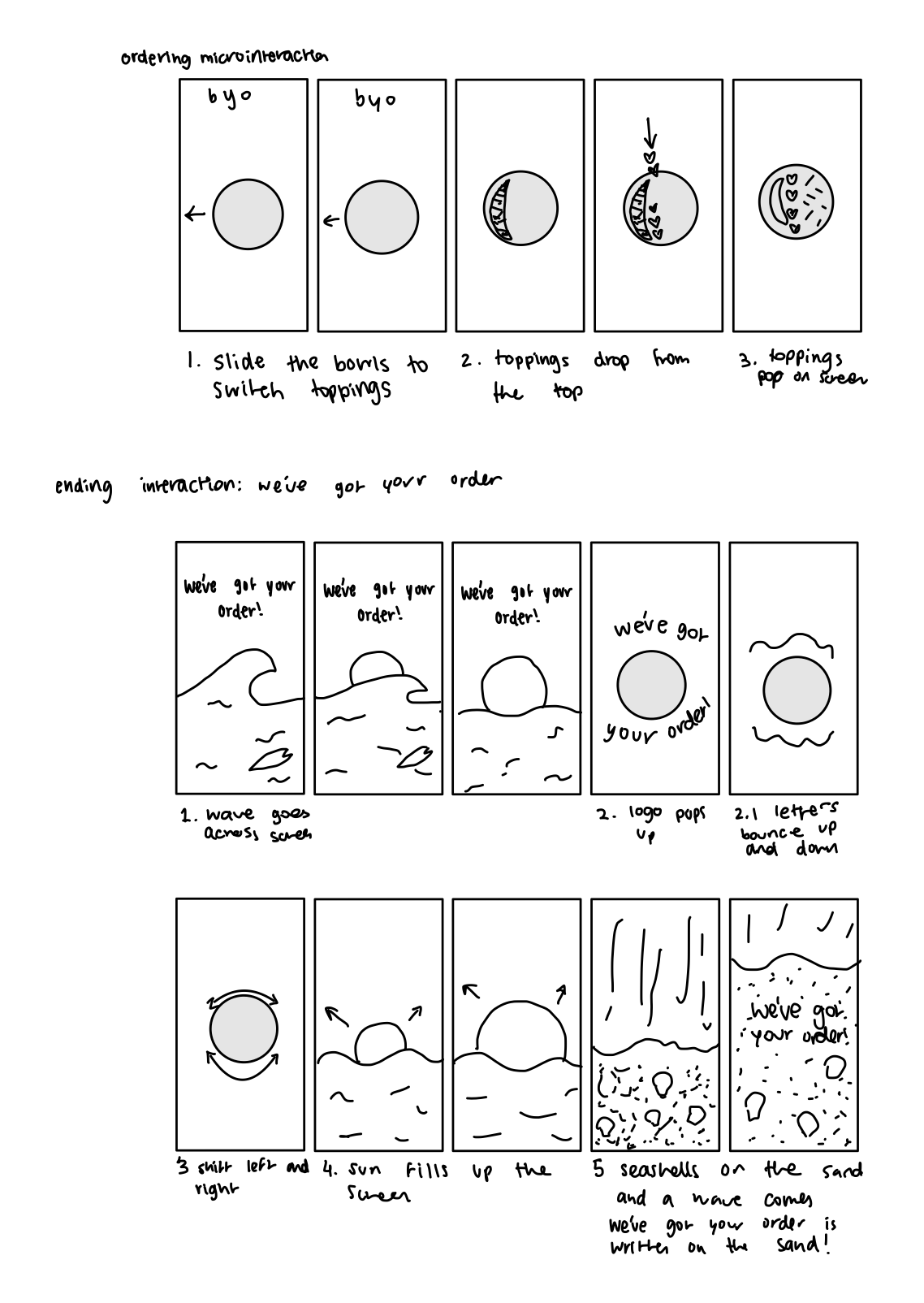
My 4 interactions were:
I was able to make these microinteractions high fidelity, creating the thorough flow and paving the way for a smooth animation.
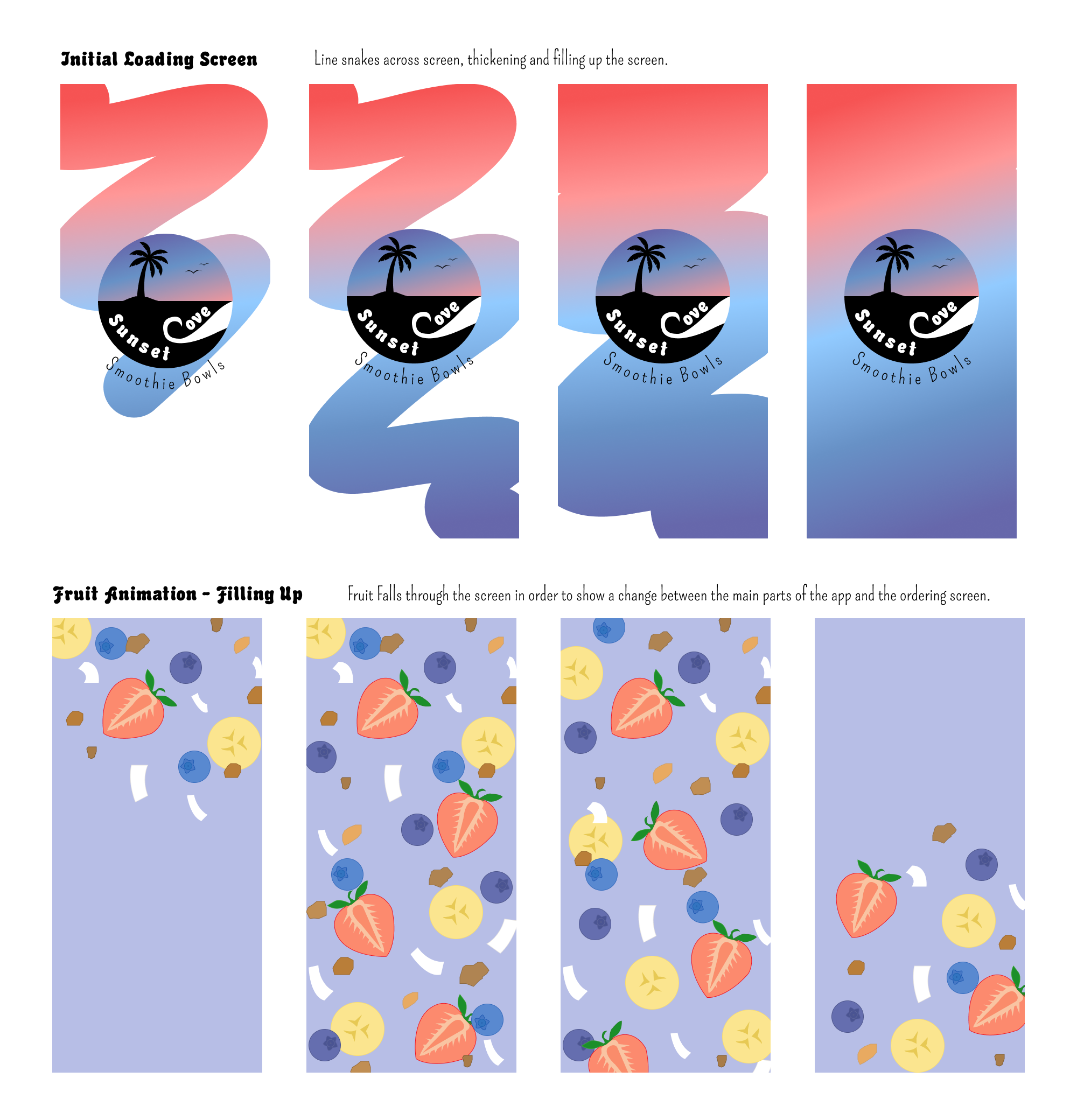
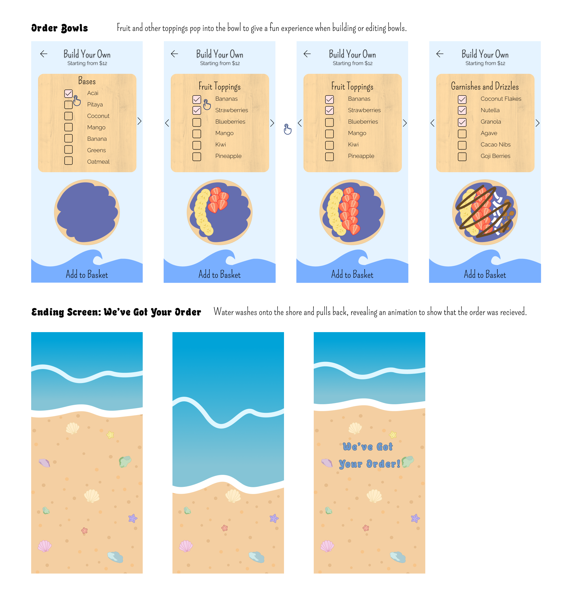
This was the final stage of the design; finalizing each screen and making sure all the assets were good quality and reflected Sunset Cove Smoothie Bowls to its fullest potential.
Here comes the animation. We were encouraged to use animation tools and software to simplify the transition from Figma frames to moving animations. I discovered Jitter, a tool that allowed me to import my Figma screens and adjust the movement for specific components. It was a journey to learn how to use the software and adjust my design along the way, but through deliberate exploration, I was able to make my vision come to life.
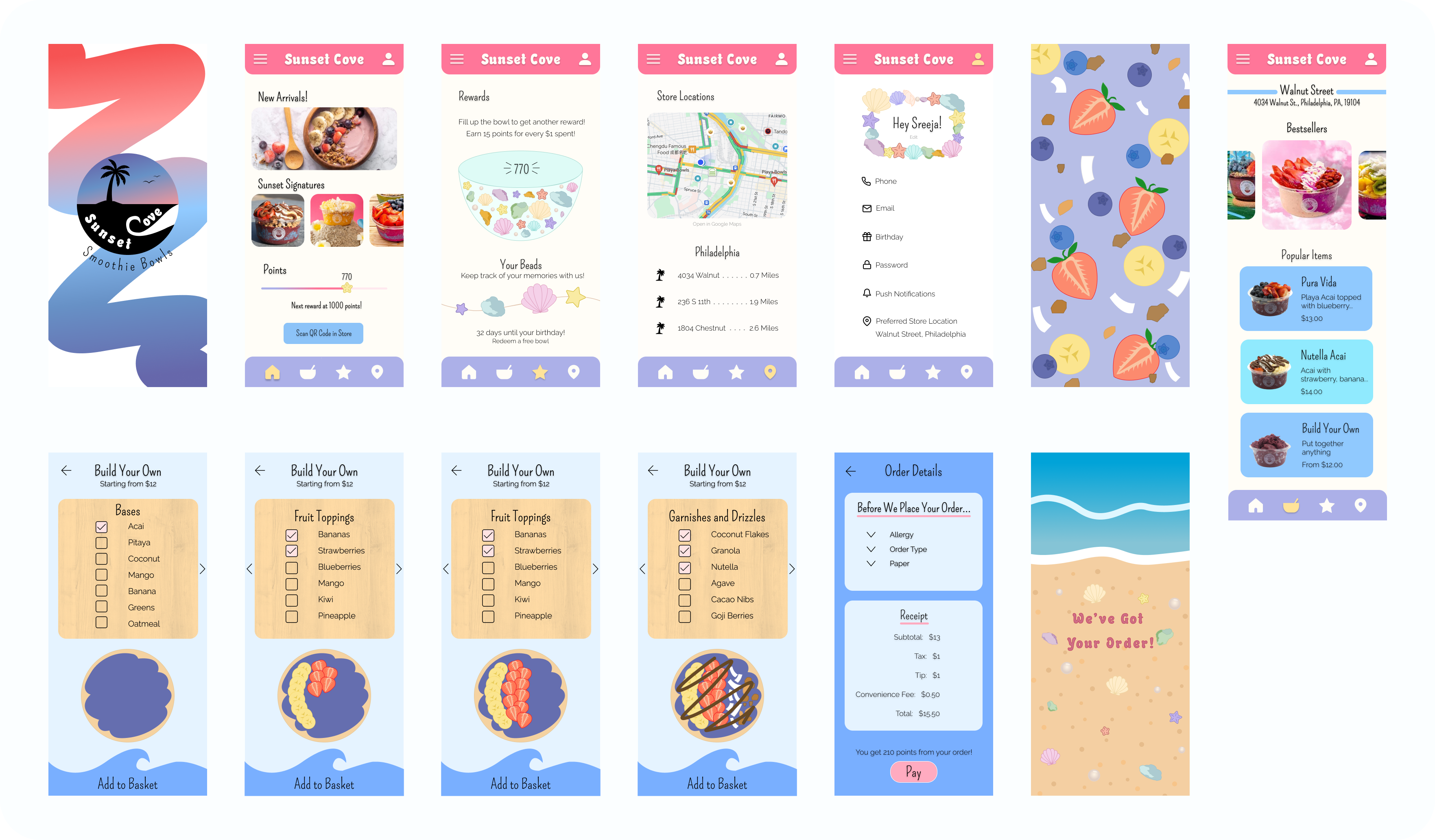
The final animation depicts the full flow of the app, as if a user is actually ordering a smoothie bowl. The smooth transitions add to the experience of a fun and bright app, and the ordering system gamifies the experience of choosing exactly what goes into your bowl.
This project tested my ability to create an idea and stick with it, even if it didn’t look like it would go well at first. During the first few weeks of this project, I was worried I would regret my choices; app, styles, ideas, etc. However, I pushed through and really felt free at the mid-fidelity prototype stage. Once I came up with cohesive ideas and saw them coming to life, my confidence grew and I was able to propel my project past any barriers I created for myself.
I’m really proud of how far I’ve come in this project. It was my first experience animating, and though I used an animation tool, I feel like it was the perfect way to learn how to structure my microinteractions. By visualizing the process in my mind and using tools to transfer my prototype into animation blocks, I was able to focus on polishing the details and creating a cohesive picture.