Maywood Library Redesign
Taking a beloved local library, and incorporating its lively branding into its website, to reach more patrons.
Role
UI Designer
UX Designer
UX Researcher
Duration
20 Weeks
September 2023 - March 2024
Tools & Methods
Figma
User Research
Heuristic Evaluations
Deliverables
6 Pages of the Maywood Library Website, in Desktop, Tablet, and Mobile Formats

Introduction
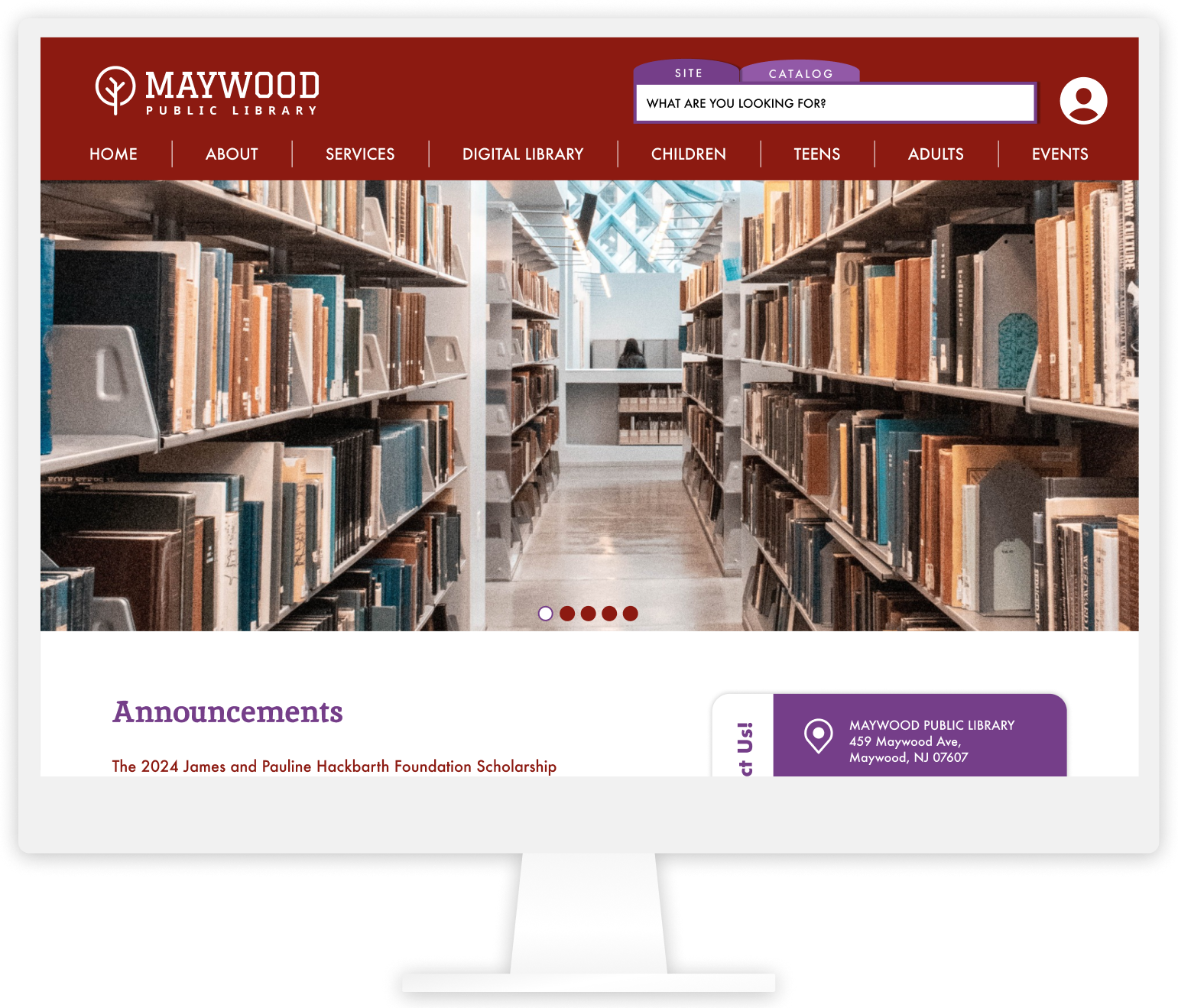
One of my first major UI projects was redesigning the site for the Maywood Public Library in Maywood, New Jersey.
As an avid lover of books who cherishes my local library, I took up the challenge to redesign the site in order to provide a more concise stream of information, including showcasing weekly events, helping volunteers find necessary documents, and creating a flow for books to be explored and ordered on the site.
Critiquing the Original Site
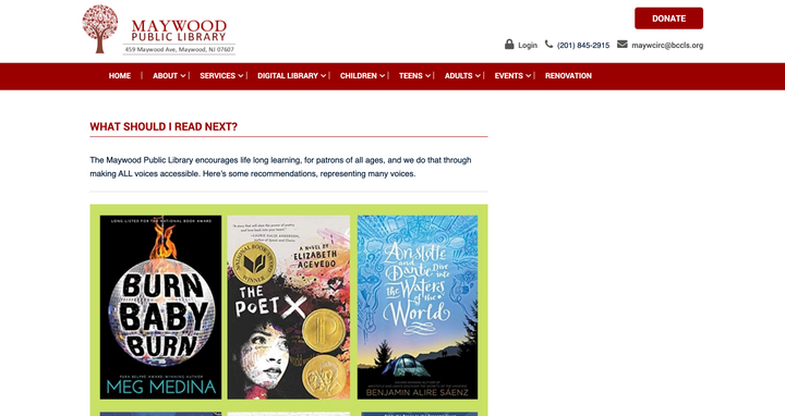
Every library has its charm. Maywood Public Library has been a well-loved aspect of the community, and residents always make their way to the library to find books and partake in events. As it was undergoing renovations at the time, I decided to revamp the site as well!
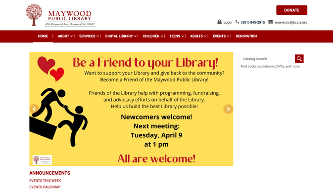
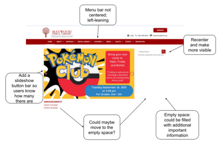
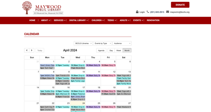
Through my research, I realized that I wanted to improve the cohesion of the site, making it look a bit cleaner and improving the information architecture. I found that a lot of people only use the site to learn about events and sign up for them, but there were a lot of elements that hindered the site rather than improved the experience. I wanted to tackle this in my redesign, while still keeping elements that made the site so loveable.
I wanted to keep the visibility of some elements of the page, but emphasize that all the elements on the page have meaning and their own purpose. On the original site, there was a lot of empty space and slight design errors that made it displeasing to look at. A lot of the features were necessary for certain users, so I decided to streamline my choices.
Original Site
User Personas
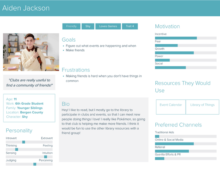
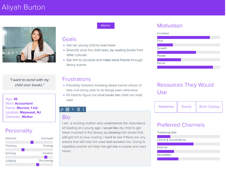
I identified my users to be of 2 different personas:
- Kids who want to utilize the library's resources and partake in its events
- Parents who want to emphasize the importance of reading to her child and want easier ways to get her child to read
Wireframing
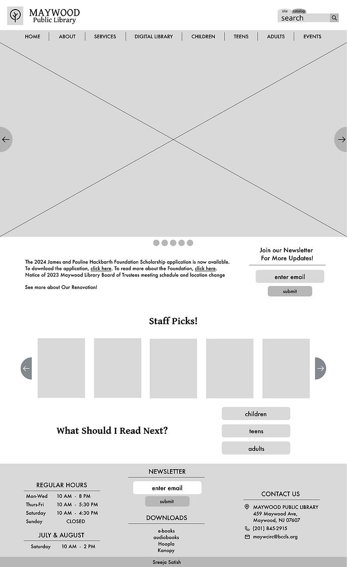
When initially wireframing, I decided to adopt the original website's architecture. However, in my later wireframes and throughout my design process, I diverted to UI that I saw would better align with the library's content and user base.

Design Systems
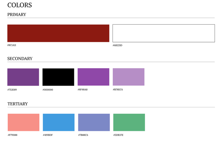
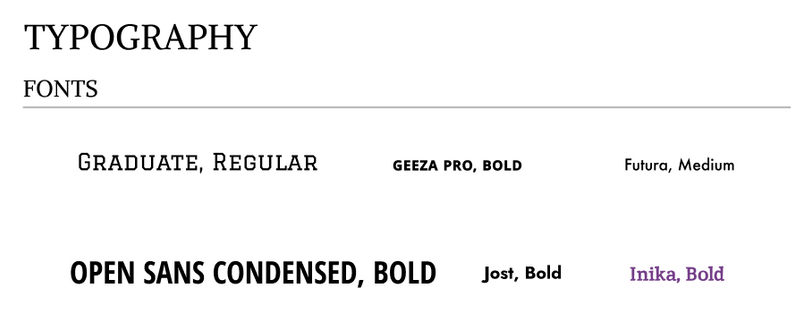
We utilized the Atomic Design Process for this project, creating atoms that turned into molecules and then organisms. I thought about utilizing colors and typography that better fit the library's brand, and would invoke peace, calmness, and slight playfulness.
Improvements and Final Results
Overall improvements I made included:
- A more concise homepage, with buttons to see how many slides are visible on the landing page
- Proper event indicators so that patrons can be directed straight to the events page and sign up
Another improvement I made was to have the What Should I Read Next? section highlighted so that users can see popular books immediately rather than clicking extra times. I made this section interactive, allowing the user to bookmark any books that caught their eye and even begin the process to ordering the book. I also added other pages for events and general library information.
To see my improvements in full, check out my Figma prototype and choose between desktop, tablet, and mobile!
Reflections
I really enjoyed this project. I was able to work on a website for one of my favorite places, and even though it was challenging, it proved to be really fruitful. I pushed myself to create components that I knew would be interesting to use and I'm really proud of how far I've come. This redesign was my first fully in-depth project utilizing Figma, and it certainly isn't the last. I'm excited to see what more I can make in projects similar to this!
